The Doctor Design Dilema
Different Users. Different Frustrations

Intermountain Healthcare

Overview
Doctors don’t care about credentialing, payer enrollment, or other mandated requirements. They care about their patients.
For decades, teams “solved” this by doing everything for them. We saw how that turned out with Start-to-Depart. The real-time data approach worked for employees, but physicians weren’t employees—they were a completely different user with a completely different problem.
As much as people wanted to take this requirement off physicians' plates, the reality was they still needed to be involved. The challenge was finding a way to simplify the process without breaking it—to design something they could trust without forcing them to care.
After two decades, no one was any closer to the answer. That’s because no one was asking questions anymore. No one was trying to understand the problem.
That was the challenge.
So we went back to the drawing board. Not to design a solution—but to start discovery. Again. Same team new challenges.
Details
PDE (Provider Digital Experience)
Intermountain Healthcare
UX Design Lead
2020
30+ Business Leaders
3 Engineering Leaders
4 Analysts
1 Designer (Me)
Figma, Miro, Whiteboards, Lots of Sticky Notes
88 Screens
23 Iterations
112 Cups of Coffee
Problem Statement
Physicians had no way to track their progress in the credentialing, compliance, or payer enrollment process. The processes to communicate and collect information were scattered across teams, emails, and different systems. The data already existed, but it wasn’t surfaced in a way that was useful to providers.


Research & Insights
Physicians avoid technical complexity like the plague.
Annual compliance frustrated physicians, and outside of hiring, they felt completely apathetic about it.
Compliance felt like a lose-lose scenario for all parties involved.


Striking a Balance
If the tool asked for too much, physicians wouldn’t use it.
If it asked for too little, the process would fall apart.
If it was too noisy, they would ignore it.
If it forced them to be too involved, they would resist it.
Through discovery, it became strikingly clear that while Start-to-Depart was great for employees, it was way too much for providers.

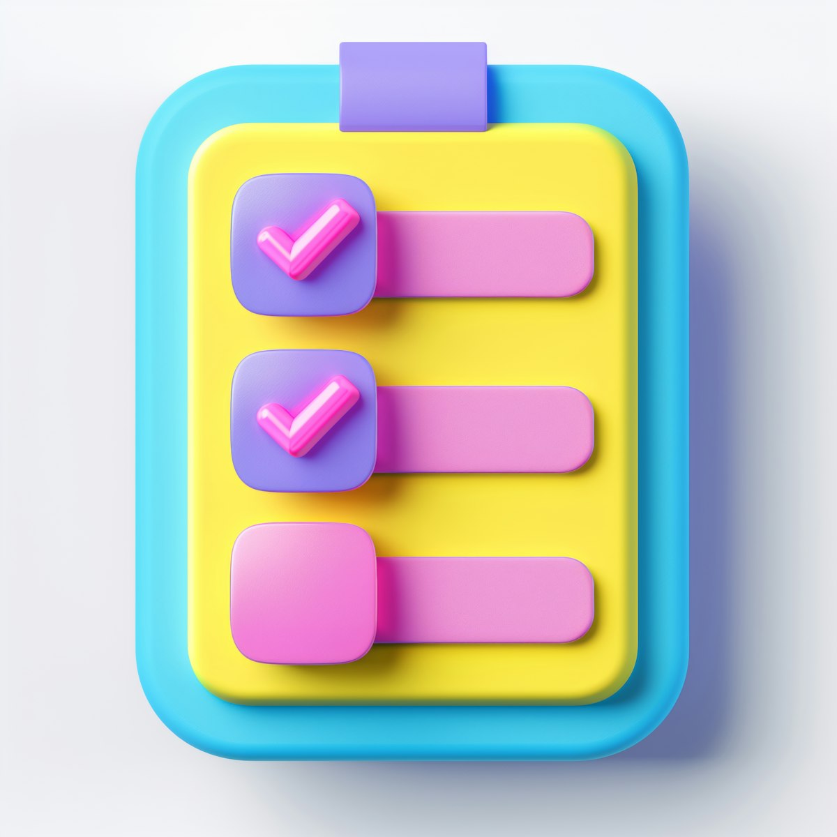
Visuals
The interface was simplified to focus on only the most relevant details. Navigation was built to work seamlessly across desktop and mobile. The system allowed providers to take action only when necessary, reducing unnecessary notifications and information overload.


Solution Statement
We weren’t designing another compliance tool—we were redesigning how physicians interacted with compliance itself.

Key UX Challenges
Reduce friction without losing function.
Give providers control without forcing them to think about it.
Surface the right data without overwhelming them with unnecessary details.

Key Features
Real-time status updates that pulled directly from the employee-facing system.
A mobile-optimized web app with no downloads or complicated setup.
Task-based interface, surfacing only what providers needed to see.
Integration with credentialing, compliance, and payer enrollment systems for a single source of truth.

Impact Statement
The hiring process was streamlined. Unnecessary emails and phone calls between providers and administrative teams were significantly reduced. Fewer delays and misunderstandings about the process meant a smoother experience for everyone. For the first time, providers could understand and prepare for credentialing process without a phone call or an email in their inbox.
The project also established the foundation for the larger Provider Digital Experience (PDE) initiative, expanding beyond just compliance tracking.

Lessons Learned
Having a solid understanding of the entire Start-to-Depart process gave us everything we needed to work with.
Although Start-to-Depart was a success for employees, physicians had a completely different set of needs and requirements—designing for that contrast was critical.
Designing less was the bigger challenge. The hardest part was figuring out what to remove, not what to add.

What I Would Do Differently
Somewhere along the way, someone decided physicians would never touch a computer, so this became a mobile-only experience.
In hindsight, with a little more work upfront, this could have been a responsive experience that worked across both desktop and mobile. It would have allowed us to share designs more effectively across the two experiences, creating better consistency and reducing redundant design efforts.

Final Thoughts
For years, compliance was a painful, bureaucratic process that wasn’t questioned. After years of quick fixes focused on doing as much as possible for physicians, the reality still remained—physicians needed to be involved. But forcing them into complexity would fail just as fast as doing everything for them. Striking that balance wasn’t about simplifying—it was about removing the right friction while keeping just enough.
What started as a single phone call of frustration in the hiring process kicked off a chain of events that exposed 20+ years of cobwebbed policies. We may not have solved every problem, but by starting with an open mind—by prioritizing understanding before fixing, inclusivity over exclusivity, and clarity over aesthetics—we created something that not only worked but gave people back a sense of control over the process.
The mindset shift wasn’t universal, but it was real. The workers—the ones buried in the process—stopped feeling like compliance was something happening *to* them and started engaging in how it could work *for* them. That was a win.
The shiny, amazing dashboards that people envisioned at the beginning may not have been as shiny or as amazing as they had dreamed—but they struck the right balance. Not too complex, not too simple. Not too rigid, not too loose. Not too much, not too little. Goldilocks would be proud.